Colors

Purple, green and orange are our primary, identifying colors. We have developed a set of complimentary tones/values of the three that allow us to expand the palette.

As much as possible, a color and its respective variations should only be used together. When more than one color set is used, a clear, visual distinction must be made between them.

Pantone
Print
Digital
Purple
Pantone 2607 C CMYK 82 / 100 / 18 / 12
RGB 81 / 12 / 118
HEX #510C76
CMYK 54 / 72 / 0 / 73
CMYK 33 / 63 / 0 / 60
CMYK 31 / 26 / 0 / 51
CMYK 6 / 9 / 0 / 73
HEX #201345 RGB 32 / 19 / 69
HEX #442666 RGB 68 / 38 / 102
HEX #565C7C RGB 86 / 92 / 124
HEX #3E3C42 RGB 62 / 60 / 66
Green
Pantone 349 C CMYK 91 / 33 / 99 / 26
RGB 0 / 105 / 55
HEX #006937
CMYK 77 / 0 / 47 / 82
CMYK 58 / 0 / 38 / 55
CMYK 13 / 0 / 9 / 33
CMYK 4 / 0 / 3 / 72
HEX #0B2F19 RGB 11 / 47 / 25
HEX #307347 RGB 48 / 115 / 71
HEX #94AB9C RGB 148 / 171 / 156
HEX #201345 RGB 69 / 72 / 70
Orange
Pantone 165 C CMYK 0 / 74 / 98 / 0
RGB 242 / 103 / 36
HEX #F26724
CMYK 0 / 68 / 83 / 30
CMYK 0 / 58 / 89 / 4
CMYK 0 / 34 / 82 / 8
CMYK 0 / 34 / 82 / 8 — (30%)
CMYK 0 / 14 / 16 / 78
HEX #B33A1E RGB 179 / 58 / 30
HEX #F5681B RGB 245 / 104 / 27
HEX #EA9B2A RGB 234 / 155 / 42
HEX #38302F RGB 56 / 48 / 47

Typography

Cera Pro and Cera Stencil Pro are our primary typefaces.

Cera Pro provides a number of different cuts and weights, allowing for a range of typographic styles and an expansive hierarchy.

Cera Stencil Pro is intended for use as a display face (headlines), and for titles and selected graphic "callouts." It should not be used for body copy.

When Cera Pro or Cera Stencil are not available, Helvetica may be substituted.

Cera Pro

https://www.myfonts.com/fonts/typemates/cera/

Cera Pro Black

Cera Pro Black Italic

Cera Pro Bold

Cera Pro Bold Italic

Cera Pro Medium

Cera Pro Medium Italic

Cera Pro Regular

Cera Pro Regular Italic

Cera Pro Light

Cera Pro Light Italic

Cera Stencil Pro

https://www.myfonts.com/fonts/typemates/cera-stencil/

Cera Stencil Pro Black

Cera Stencil Pro Bold

Typestyles

A range of type treatments, shown with recommended sizes and measurements, are available.

Headline — Uppercase

Black, 48pt size, 48pt leading

On the edge
of a lake,
at the center
of everything

Subhead — Uppercase

Black, 18pt size, 20pt leading

Because the future we're
focused on is yours.

Subhead — Stencil

Stencil Black, 18pt size, 18pt leading

Because the future we're
focused on is yours.

Subline

Light, 13pt size, 18pt leading

Head

Black, 10pt size, 12pt leading

Body

Regular, 9pt size, 12pt leading

Come meet us by the lake. We share the same goal.

Location

320-acre campus in Geneva, in New York State's Finger Lakes Region and along the northern tip of the 38-mile Seneca Lake.

Typestyles

When used as a graphic element—such as a single, stacked polysyllabic word or a numeric factoid—Cera Stencil Pro asserts the HWS brand look.

Display

Stencil Bold / 100pt size / 70pt leading

Type should cover a large portion of the document and have a line-height 70-80% of the type size

Exp
erie
nce

Quote

Text: Bold / 13pt size / 16pt leading
Source: Bold / 8pt size / 10pt leading
Info: Regular / 8pt size / 10pt leading

When set on an image, the quote should be contained inside a colored box with a 2pt white stroke around it. On white, the quote is styled with a 8pt stroke offset above.

"Coming to HWS, I was lost in terms of a career path. Career Services helped start conversations that led to an internship in my first year." Hrithik '23, Queens, NY

"Faculty are your guides, but they're also your colleagues. We, too, are confronting a bewildering world where so much is changing so fast. The spirit of HWS is something like this: come, let us navigate together."

Matthew Crow, Associate Professor of History

Factoid

Number: Stencil Bold / 60pt size
Ordinal Indicator: Stencil Bold / 36pt size
Text: Bold / 8pt size / 9.5 leading
Info: Light Italic / 8pt size / 10pt leading

Factoids used in advancement communications should replace instances of Cera Stencil Pro with Cera Pro.

More than
35
Countries where HWS students have traveled and studied over the past five years
9th
For Study Abroad
2021 edition of The Princeton Review's Best 386 Colleges

Graphical Elements: Shield Pattern

The shield pattern is available in a range of colors in the palette. To add a layer of visual interest, it can be used as texture in certain applications. Care should be given to readability when the pattern appears with small type.

White shield pattern at 40% opacity
White shield pattern at 30% opacity
White shield pattern at 40% opacity
White shield pattern at 45% opacity
White shield pattern at 50% opacity
White shield pattern at 30% opacity
White shield pattern at 40% opacity
White shield pattern at 45% opacity
White shield pattern at 40% opacity
White shield pattern at 30% opacity

Graphical Elements: The Journey

Combining these graphical elements with our colors and type helps create a distinctive HWS look and feel.

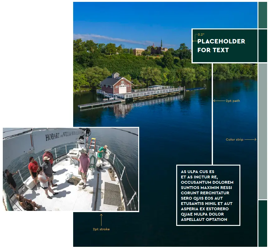
Conceived as an element to help convey student journey mapping, solid lines are used as strokes for images, text boxes, color boxes and paths connecting different elements.

Square/rectangular boxes may be used to frame text or images. Text contained in these shapes should be left justified and have a minimum padding of 0.2 in.

On a spread of multiple images and text boxes, elements should loosely follow a grid and overlap to depict a collage effect. Additionally, a white, 2pt path can be used to connect the different elements.

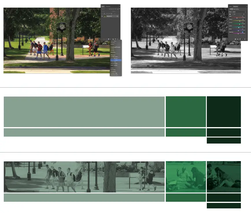
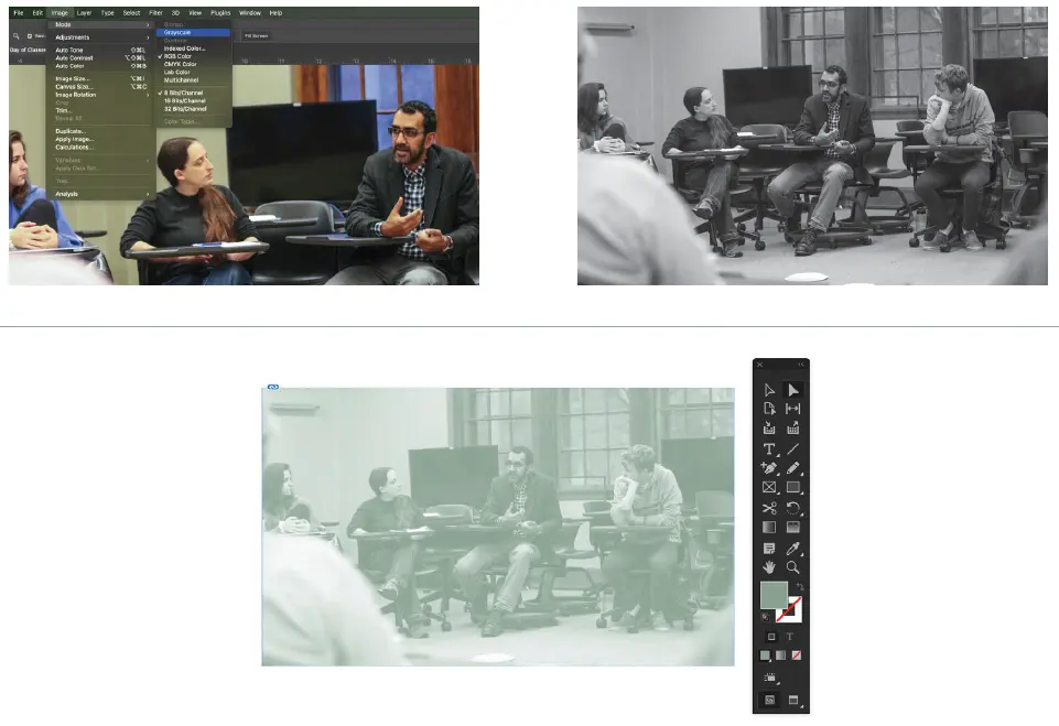
A multicolor, horizontal color strip can be used as textural, photo containers or as solid boxes to support a narrative. A vertical color strip using a singular color set can be used as page decoration.

Headline Theory

Headline Theory

Copy Style

Our headlines are intended to serve as a serialized conversation between HWS and our readers—in this case prospective students and families. The tone is knowing but informal and approachable. A provocative wisdom should invite readers into secondary layers of content.

Creating the Transparent Box

  1. Set the copy (left justified and in Cera Pro Black)
  2. Create a box with a 2pt, white stroke and an HWS fill color
  3. Set the blending mode of the fill to "Multiply" and adjust the opacity if needed

Creating the Solid Box

Create a box with a 2pt, white stroke and a fill color from the same HWS color set.

Creating the Connector Lines

Draw a 2pt, white path between the two boxes using horizontal and vertical lines

Main Box Construction

Headline Theory

Image Theory

Photos showcasing the beauty of our campus are an invaluable asset to this toolkit. Breathtaking aerial shots of the quad, lake and surrounding area should evoke a feeling of opportunity and discovery. These are balanced with shots of engaged students in educational and hands-on activities that showcase the HWS community and experience. Eye contact among subjects—and occasionally with the reader—helps underscore the personal relationships that are a hallmark of an HWS education.

Image Theory Example

Image Theory

Preparing the Images

  1. Open the photo in Photoshop
  2. Add a "Black & White" adjustment layer
  3. Adjust the sliders if needed to improve contrast
  4. Save as a new image

Creating the Boxes

  1. Set up the color boxes for horizontal images
  2. Use the colors from lightest to darkest
  3. Build the lines with a 2pt, white stroke

Applying the Images

  • For images on top of lighter colors, set the blending mode to "Multiply"
  • For images on top of darker colors, set the blending mode to "Overlay" or "Soft Light"
  • Reduce the image opacity to around 70%

Horizontal Box Construction

Headline Theory

Image Theory

Preparing the Images

  1. Open the photo in Photoshop
  2. Change the color mode to "Grayscale"
  3. Save as a new image

Creating the Color Overlay

  1. Import the grayscale image into InDesign and position as desired
  2. Using the direct selection tool, select the image
  3. Apply an HWS fill color

Creating the Spotlight

  1. Copy the frame and paste into place, duplicating the image and its position
  2. Replace the image with its original, color version
  3. Without moving the frame, resize the container as desired
  4. Can be shown with or without a 2pt, white stroke

Color Overlay With Spotlight Construction

Headline Theory